


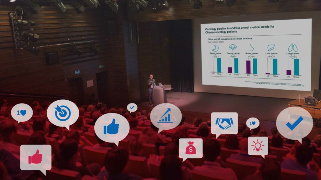
When presenting at high-stakes meetings — whether you are pitching to investors, soliciting partnerships or justifying value proposition at a healthcare conference — having an effective corporate presentation is imperative for a successful outcome.
It’s no secret that our attention spans have become increasingly hard to capture. More than ever before, our sustained concentration is task-dependent and relies heavily on factors such as relevance and engagement. For an effective investor presentation deck, this means having clear, concise content coupled with an aesthetically-pleasing design.
Below are a few simple steps (and tools) that will help you visually enhance your corporate presentation.
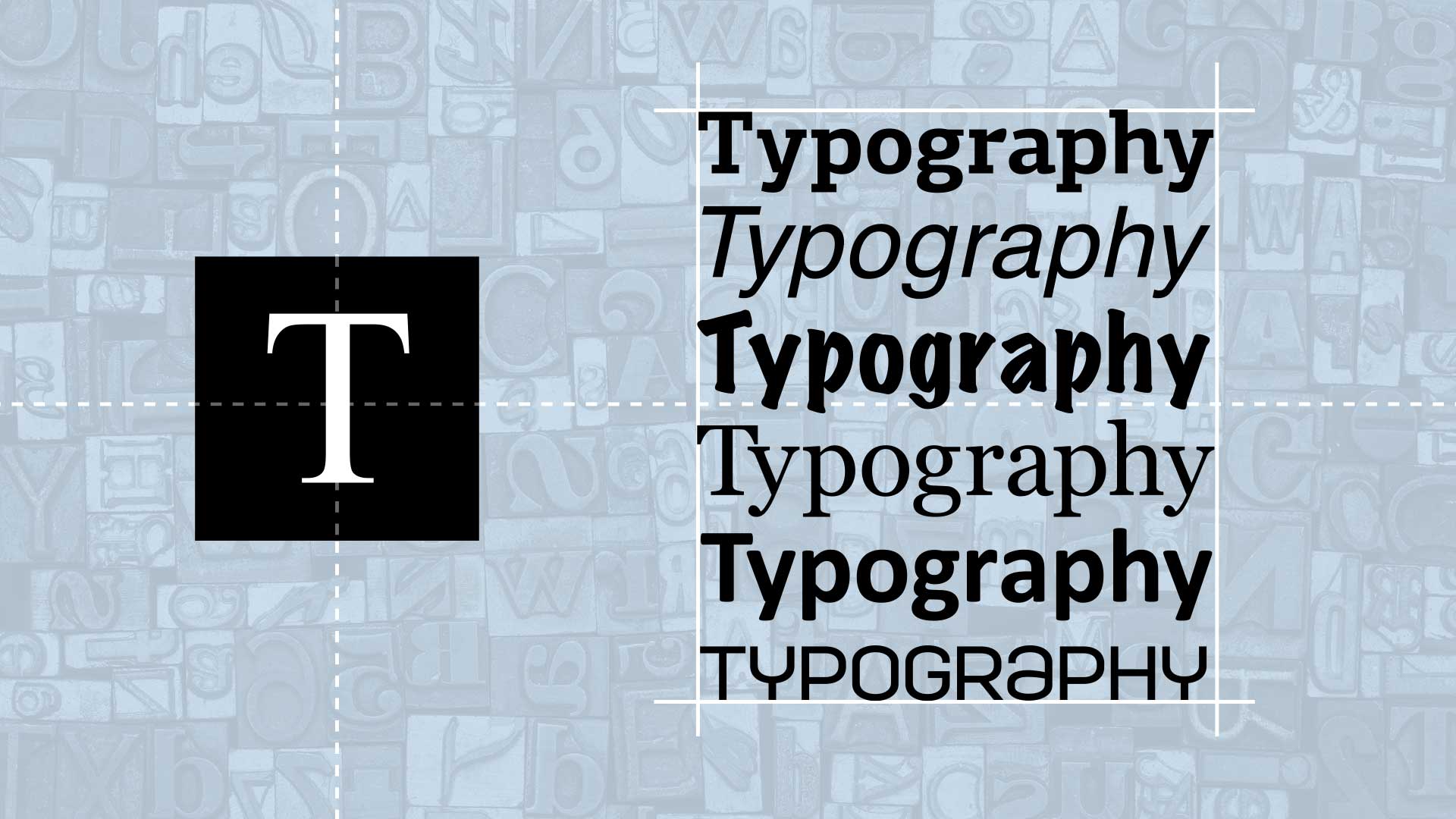
FONT TYPES.
Fonts give your brand and marketing materials a voice.
For example, if a company develops cutting-edge technology, aggressively penetrates the market, and has industry authority — a suitable voice would be firm, confident and sharp. To capture this voice in-print, the company would choose a font family with thin lines and sharp edges that is perhaps even slightly condensed.
In contrast, a company that develops life-changing therapeutics or provides care services to patients, and is looking for funding or still in the discovery mode, an appropriate brand voice would be soft and caring. For this company, the voice would translate into a more rounded font with soft edges, and perhaps a bit thicker line.
When you select system fonts like Arial, Helvetica or Calibri, you deprive your corporate materials of a unique voice and an opportunity to have your deck stand out from others. Especially when presenting at investor healthcare conferences like JP Morgan, Jefferies, Citi, where you’re competing for investors’ attention with dozens (even hundreds) of other companies.
Fonts also play a role in evoking emotions — which is important when trying to connect with your target audience. A landmark study from MIT and Microsoft concluded that correct typography made readers feel good and as a result, more likely to take action or be inspired by what they had just read.
Consider utilizing nontraditional — but on-brand — typefaces in your slides. Custom fonts will set your presentation apart cue favorable associations with your company.
Free font tools.
DaFont is a great database of thousands of creative fonts — completely free to use. You can browse alphabetically, by theme or type, or with their search function.
Google Fonts were created to give websites unique voices. Google Fonts are released under Open
Source License , which allows you to use them for free in digital and printed media.
Professional (paid) options.
If you are looking for a licensed font family, we recommend using MyFonts. Their interface is easy to search and allows users to preview fonts before purchasing.
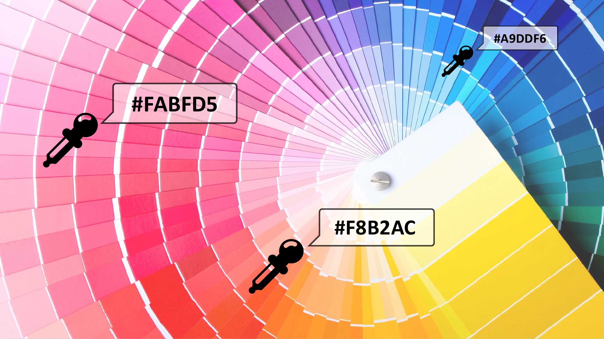
COLOR SELECTION.
When creating a presentation deck, color choice is equally important for clarity, appearance and audience association. Colors can evoke strong human emotions, often unconsciously, and if you choose carefully, you can use color combinations to increase the impact of your message.
Color psychology, which falls under the umbrella of behavioral psychology, is the science of why color affects human behavior. When we see color, our eyes communicate with the brain’s hypothalamus sending signals to the endocrine system’s pituitary gland that in turn signals the thyroid glands. The thyroid glands then release a flood of hormones which causes a change in mood, emotions and thus, resulting behavior.
Color psychology is used in almost every trade. From marketing to interior design to the food industry, professional industries use colors to manipulate their audiences. In advertising, this is especially evident. Brands spend time and money figuring out appropriate colors to include when advertising their product or service because they know the right colors will evoke specific behavioral responses.
When choosing colors for your presentation, select a combination 2-3 (maximum four) colors. Usually, it’s a good idea to start with your company’s branded colors, and build an overall scheme from there, adding corresponding shades for interest. Color theory 101 employs the 60-30-10 rule, which is a good principle to follow when developing your corporate presentation: use your primary color 60 percent of the time, your secondary color 30 percent of the time and reserve your accent color for the remaining 10 percent.
Free color tools.
Colormind is a minimalistic color generator. Enter your color values, lock it, and the program will generate color combinations. It can also identify colors from an uploaded image.
Coolors is an easy-to-use application that generates color schemes. It’s free to use but might require registration to save your preferences and generated combinations. This app also identifies colors from an uploaded image.
For a professional color generator, try Adobe Color. It relies on the data collected from professional
designers in Creative Cloud and has all necessary filters: choose the desired color mode, adjust the color group, etc.

GRAPHICS AND IMAGES.
Do you know why they say ‘a picture is worth a thousand words’? It’s because complex ideas are more effectively conveyed with a single image than a block of text.
Our brains process images faster than text. Approximately 65 percent of the population are visual learners — those who ascertain knowledge best through visual communication. Images have the ability to create stronger, more detailed memories, so your audience is likely to retain the main messages from your presentation if you include visuals of substance.
So, make sure not to overload your audience with text-heavy slides. Instead, break up blocks of text with compelling visuals that communicate your main points. From pictures and photographs to charts and diagrams to illustrations and animations, there are a lot of ways to incorporate visual elements into your corporate presentation and enhance audience understanding.
Free graphic tools.
KissPNG is a good option for adding visuals and graphics to your presentation. KissPNG allows users to access thousands of free images and illustrations with transparent backgrounds with unlimited downloads.
For vector icons, try FlatIcon, a website created for and by designers and developers. They boast the largest database of free, customizable icons in the world.
Professional (paid) options.
If you are looking for a cheap stock photo site, we recommend 123rf. It has all typical stock images you’d find on other similar sites but at a bit of cheaper price point. After registration, users can purchase credits either on demand or via a subscription plan.
We recommend Adobe Stock if you are looking for creative inspiration or conceptual images. It has more unique images than a typical “cheap” stock site. It also allows you to buy credits on demand or by subscription.
Effective scientific corporate presentations can be created successfully in-house, but oftentimes companies
that work in complex science and technology can benefit from having a professional service
provider who also understands science, develop their presentation. At Theoria Creative, our deep understanding of science combined with our outside perspective allows us to engage the entire communication process when developing presentations, including messaging, storytelling, content development, and design to clearly communicate value proposition to your target audience. Contact us for more information.